CHALLENGE STATEMENT
To re-position the Tampax brand against its core values to make those who bleed feel confident and empowered by their choice.
BRAND VALUES
Empowerment Education Sustainability
For this brand refresh, I wanted to keep the essence of the original brand alive. Tampax is a well-known name, so my goal was to inject some much-needed modernisation, while keeping the brand recognisable.
I decided to keep the logo, gradients, and blue-based colour scheme intact but with some key changes.
To the classic Tampax blue, I added shades of blues, purples, greens and pinks to create greater depth and fluidity across the various assets.
The gradients were adapted with these new colours in mind, with the addition of illustrations as a nod to the original packaging.
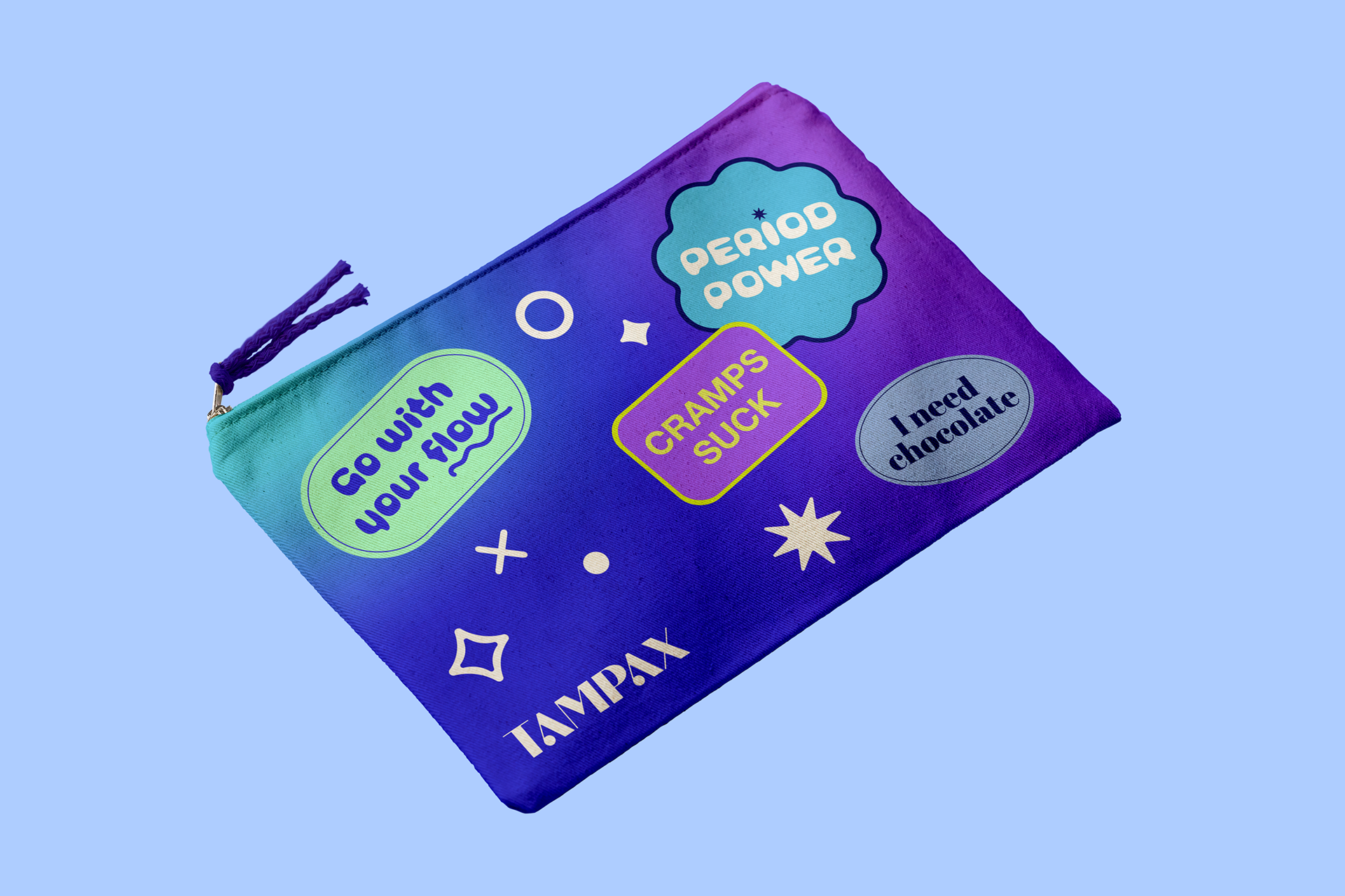
The logo speaks to the original but has been updated with a more modern typeface and bespoke elements.
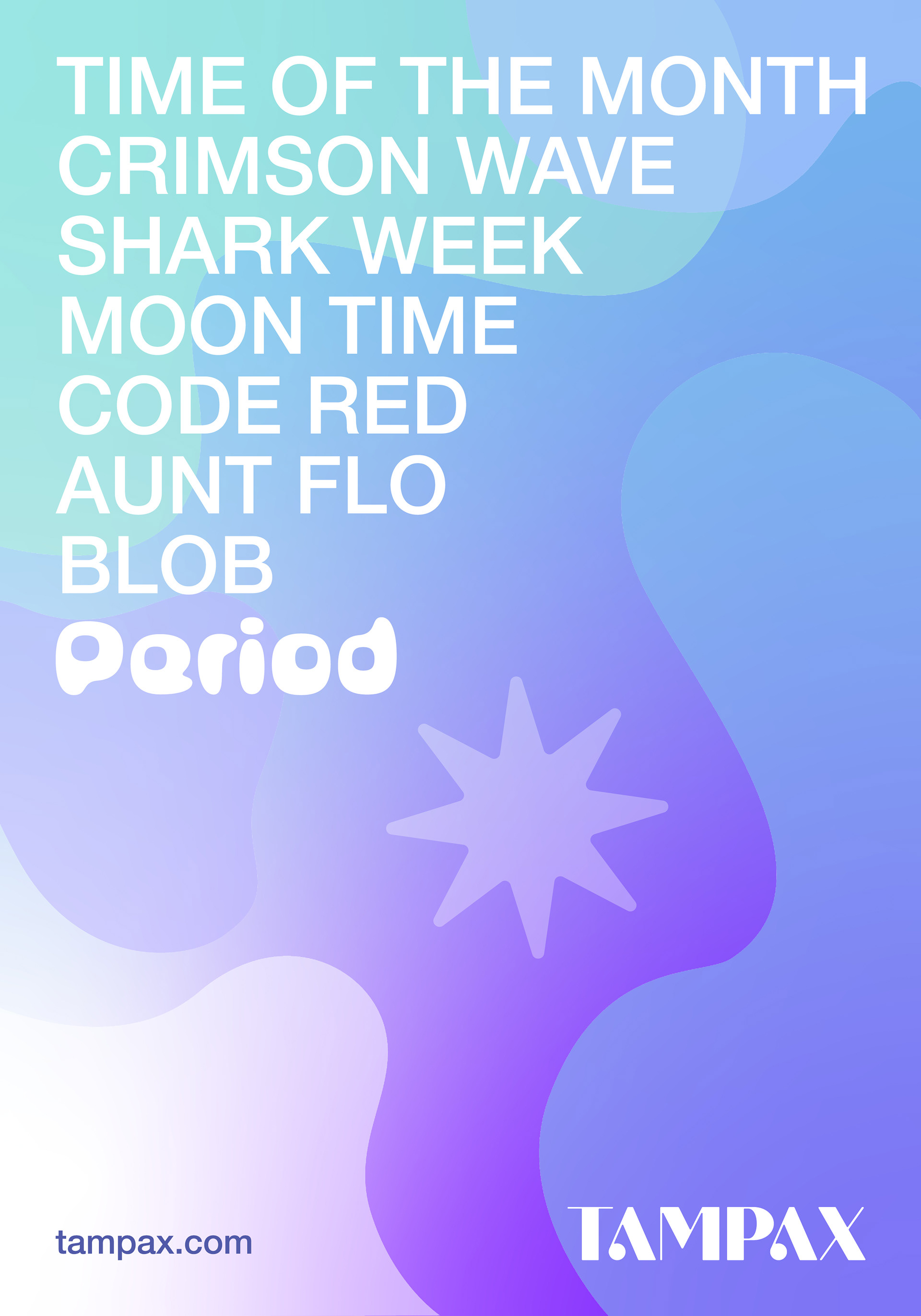
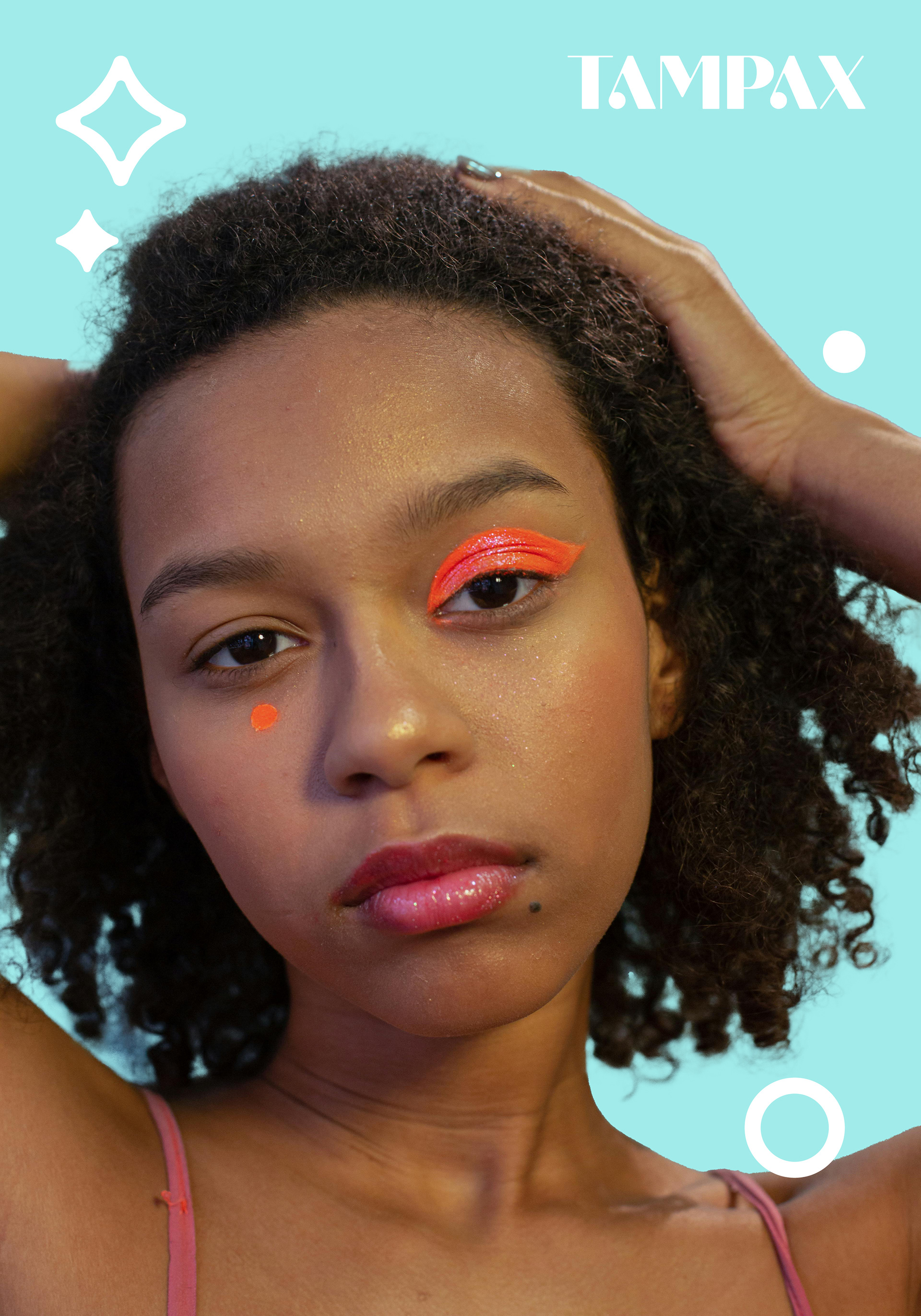


For the rollout, the tone of voice of the original brand has been enhanced to bring more power to the audience. With its core values being empowerment and education, the tone of voice needed to speak to the that.
The key slogan, 'Your Period. Your Rules.' is all about bringing power and confidence to those who bleed. It changes the narrative around periods for young people today by allowing them to take ownership of their cycle without feeling the need to hide away and not speak about it.



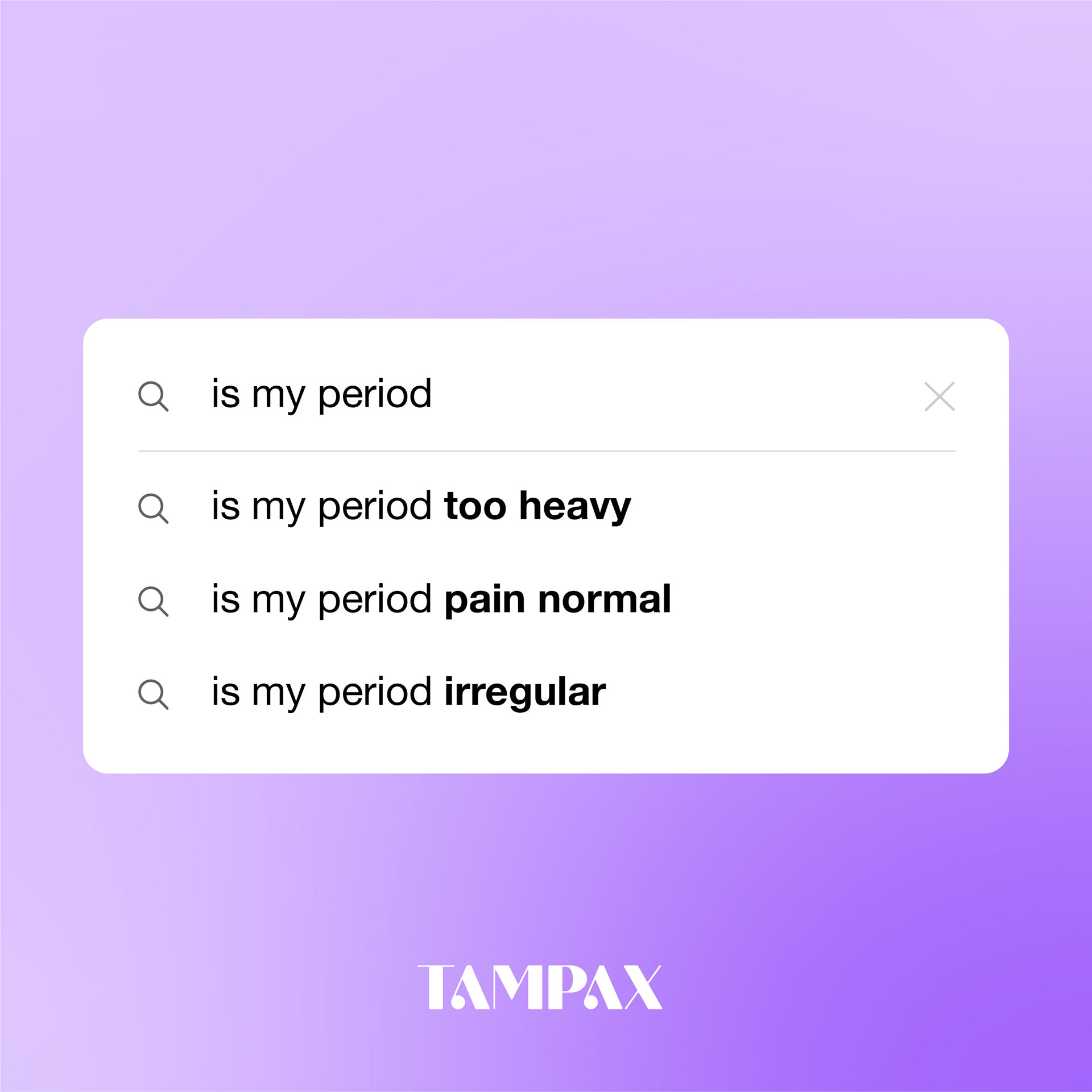


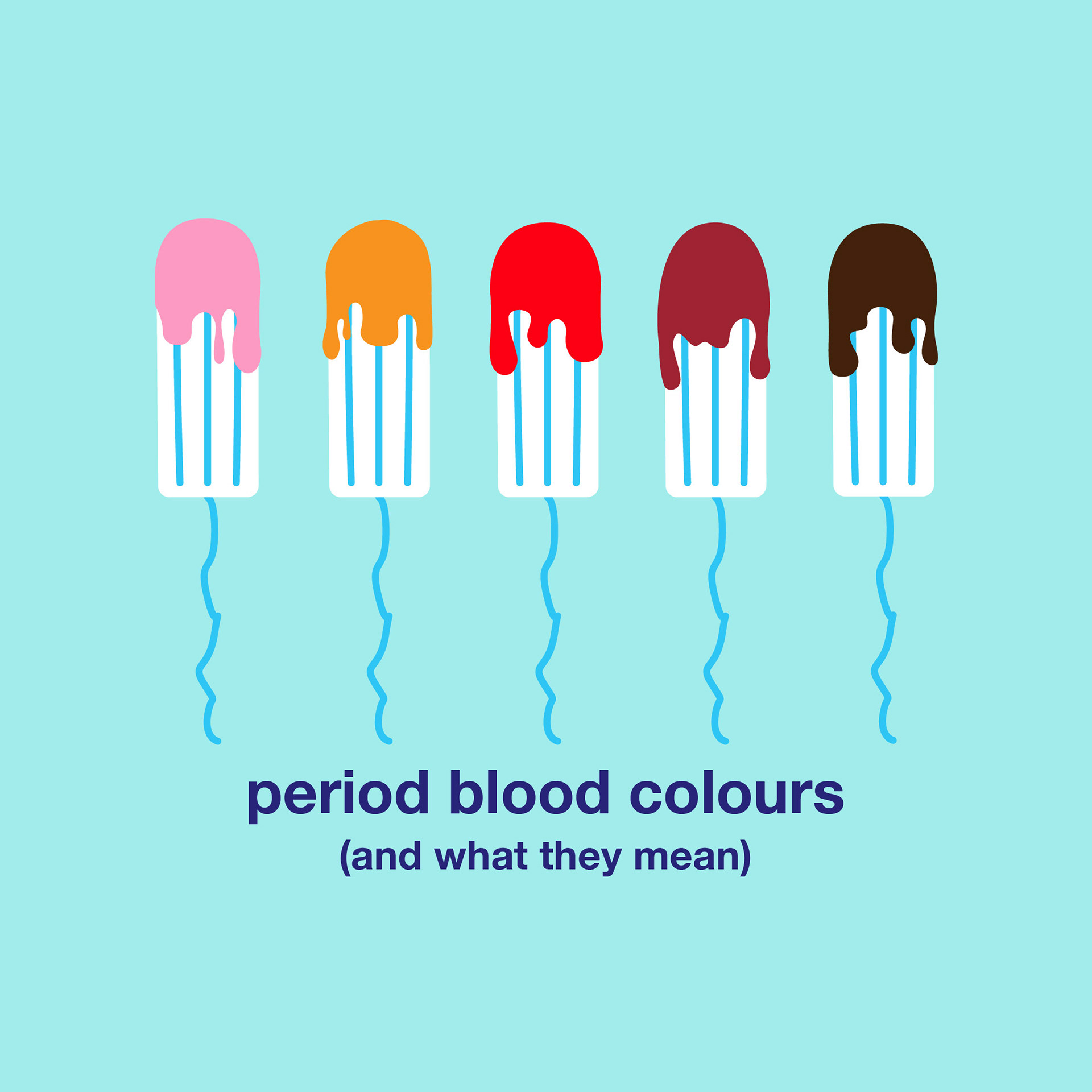
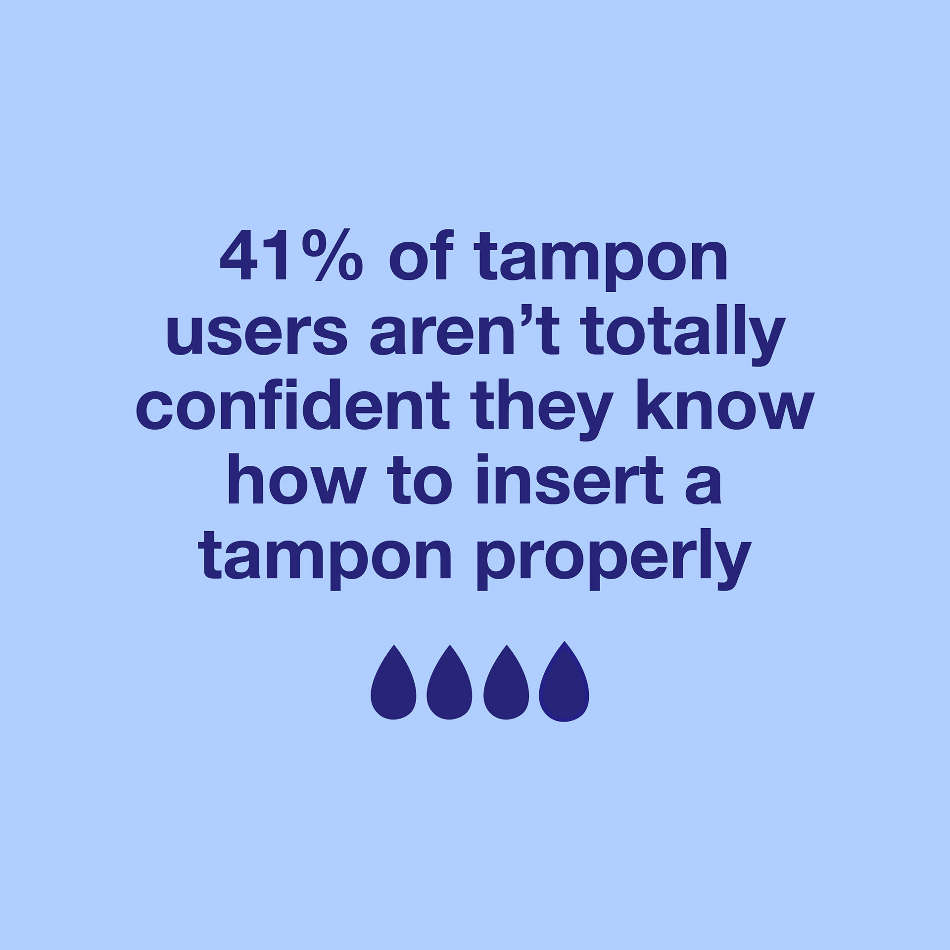

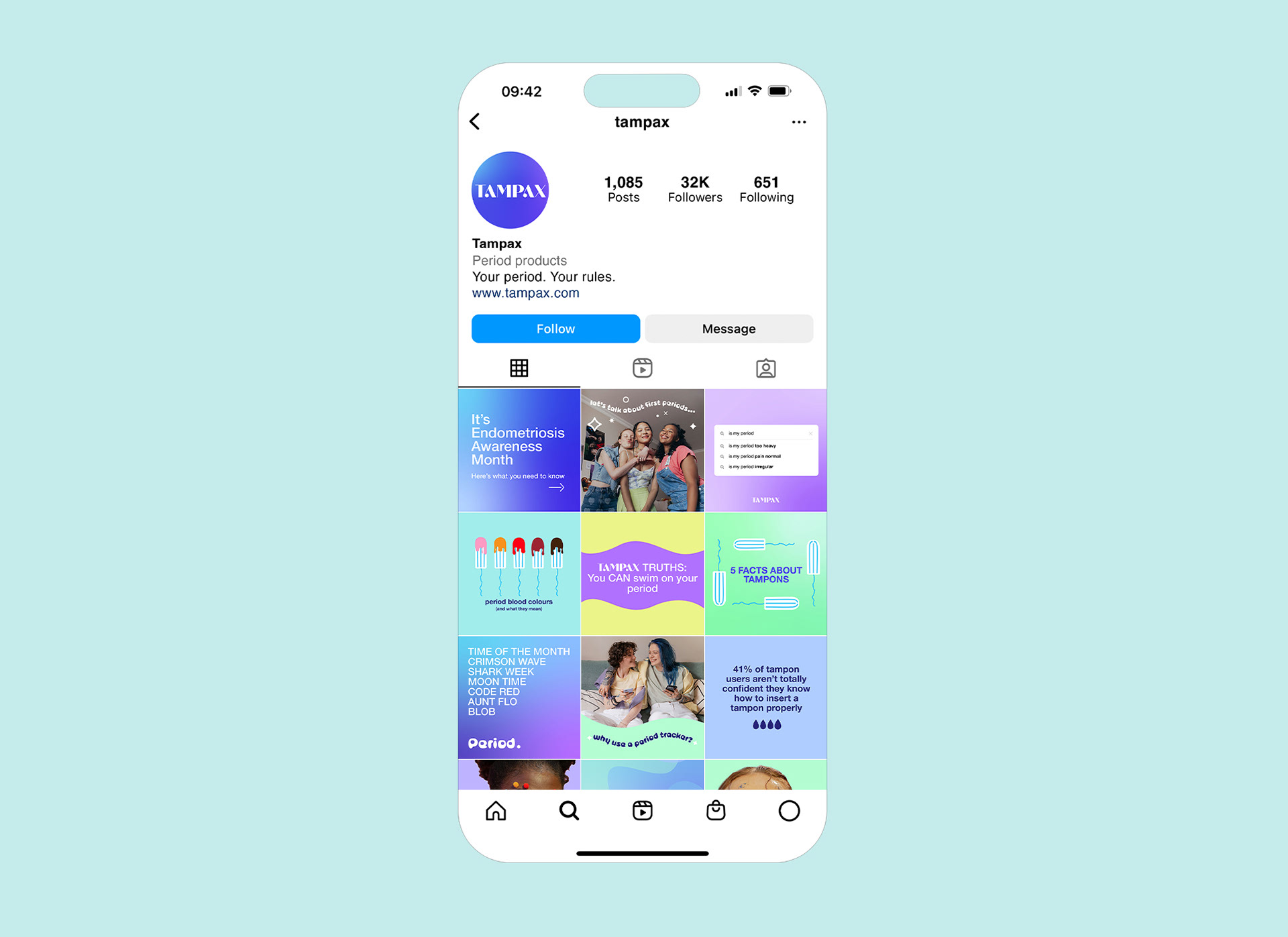
For the digital portion of this project, I chose to revamp the Tampax website to make it more fresh and youthful. As well as product promotion, I wanted to include an updated, easily accessible ‘Learn’ section on the website, to house all blog content - from period myths to advice on how to insert a tampon.
I’ve included a link to an updated period tracker, as well as an animated banner to bring the site to life and shine a light on the new brand slogan, ‘Your Period. Your Rules.’
I’ve included a link to an updated period tracker, as well as an animated banner to bring the site to life and shine a light on the new brand slogan, ‘Your Period. Your Rules.’


